In 2020, I collaborated with Livi Bank’s design team to help establish the bank’s visual and digital identity ahead of its official launch. Working closely with the Head of UX/UI, I contributed to developing a cohesive brand system that balanced modern fintech aesthetics with user trust and accessibility. The project encompassed digital interface design, visual language definition, and brand consistency across both mobile and web platforms.
As one of Hong Kong’s first virtual banks, Livi Bank needed a distinct identity that would communicate innovation, credibility, and ease of use to a largely traditional banking audience. The challenge was to design an approachable, tech-forward experience that could build user confidence in a digital-only financial platform while expressing the bank’s fresh, optimistic personality.
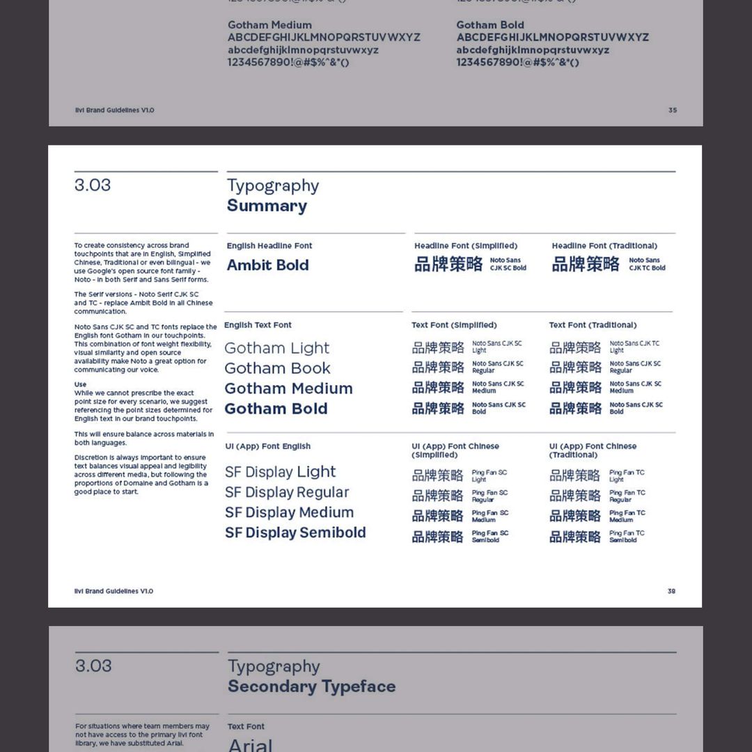
I worked with livi bank to create a consistent and appealing brand identity that can be applied across different platforms and channels. Selecting a modern and elegant sans-serif font that reflects their digital-first and customer-centric approach. I also adjusted their color scheme to enhance readability and contrast on various devices. Using the updated branding guidelines, I designed new digital ads that showcase livi bank’s features and benefits. The ads were integrate into their social media and display networks, resulting in increased engagement and conversions.


Following the creation of Livi Bank’s brand guidelines, I extended the visual system into a series of social media campaigns that brought the brand to life across everyday touchpoints. The ads translated Livi’s friendly, lifestyle-focused identity into scroll-stopping visuals, combining bold colour blocking, clean typography, and simple iconography with concise, benefit-led messaging. I designed modular layouts that could flex across formats (stories, feed posts, carousels) while maintaining strong brand recognition and consistency. These assets helped reinforce Livi’s positioning as an approachable, digital-first bank by showcasing real-life use cases, playful motion, and clear calls-to-action that encouraged users to explore the app and its features.

Livi’s early growth was strongly supported by a design language that made a completely new virtual bank feel simple, human, and low-friction to use. The bright, lifestyle-led visual identity, conversational tone, and clean UI helped reduce the perceived risk of trying a digital-only bank, which contributed to livi attracting over 41,000 customers in its first year. Consistent branding across the app, marketing, and product touchpoints reinforced trust and recognition, laying the foundation for livi to scale to more than 150,000, then 200,000 customers and roughly HKD3 billion in deposits as the brand matured. By tightly aligning the brand identity with an intuitive UX, the design made livi’s value proposition immediately legible and approachable, directly supporting user acquisition, ongoing engagement, and growing confidence in its digital services.